Pure Gold from Local Presentation Guru
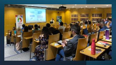
The latest instalment of The Art Of The Start (TAOTS) featured our local hero and Clearpreso.comfounder Ed Fidgeon-Kavanagh. The newly reconfigured AOTS brings together an audience comprised of SBI researchers, Conway staff, MSc students in Biotechnology & Business courses and our friends from the real world (a.k.a the general public) for discussion about enterprise, selling, marketing, science and professional development.
Ed, a former UCD graduate, is a recognized expert in the art of presentation. He has worked with many successful companies large and small to help them to develop compelling and effective slide-decks.
Here are some of Ed’s key visual tips:
- Get rid of the LOGO: Your presentation doesn’t need to have your logo on every page. Most people have reasonable memories and don’t need to be reminded of who you are OR who you work for on every slide. Apart from that, it reduces available space for the important stuff you want to say.
- Use the right FONTS: Use audience appropriate fonts. Don’t use Comic Sans if your business is undertaking.
- Use the right IMAGES: Don’t use poor resolution or worse stolen images. If you are using impact images, use the whole screen and deliver the message around that image using the spoken word.
- Step away from the ANIMATIONS: Animation heavy presentations are distracting and incredibly difficult to deliver. Don’t do it. Use simple transition functions like push, slide and appear.
- Use the right charts for your DATA: In this technical audience there was particular interest in effective visual presentation of data. Ed’s message was to use colour contrast to focus on key data points that reinforce your findings. At the risk of being tangential, if you want to see a good example of an amazing presentation of technical data check out Hans Rosling’s TED talk from a couple of years ago here.
- One Size NEVER fits all: There is no perfect slide count. Eds’ talk was about 30 mins long. He used a staggering 175 slides to get his points across. The interesting thing was that the audience didn’t even notice all the slides. They were engaged. Ed’s message on slide count was to use the number of slides that you need to make the presentation engaging.
You can find Ed’s slides from today’s session here and more about his work here

